COMPANY LOGO
Company Logo

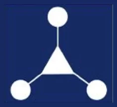
The RESOURCES ID logo is designed to reflect the company's core values, vision, and mission as a leader in the technology and business solutions industry. Below are the main elements of the RESOURCES ID logo and their explanations:
Basic Shape & Philosophy of Paper Windmill
 Paper Windmill Symbol: The paper windmill can be the main element of the logo, depicting flexibility, innovation and dynamism in the service process that rotates in an integrated and balanced manner.
Windmills can also symbolize the sustainable flow of energy and harmony with nature, which is relevant to the exploration and mining industry.
Movement and Transformation: The spinning wheel can symbolize constant movement and development, referring to the company's ability to constantly innovate and evolve.
Collaboration and Harmony: The windmill works through each propeller moving in tandem, reflecting collaboration and synergy between different departments or services within one system.
Shape Element
 Simple Geometric Shapes: Windmill shapes can be given geometric touches such as simple triangles and circles to reflect professionalism and orderliness, as well as show the stability and efficiency of the company in providing services.
Symbol of Unity
 Circularity: Using the shape of a windmill or uniting the propellers at the center of a triangle to emphasize the idea of unity/stability, synergy, and continuous flow of energy among the company's services.
By combining simple yet meaningful visual elements, the logo will depict efficiency, innovation, professionalism, and the values carried by the company as part of MIND ID and ANTAM.
Typography
Modern and Minimalist Fonts: The use of modern, simple, yet bold typography to emphasize professionalism and trust in the services provided. The font used is Montserrat Bold.
Color Elements

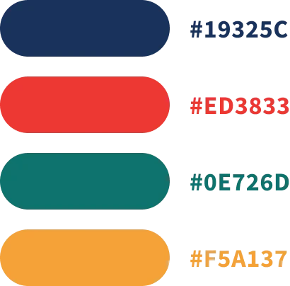
Red Green and Blue: The color red is often associated with strong passion and commitment. In SSC, a passionate and dedicated team is important to maintain high service quality and ensure internal customer satisfaction.
Green can symbolize nature and the environment, while blue can depict technology, trust, and professionalism, reflecting a focus on exploration and development. Gold/Yellow: As a subsidiary of ANTAM, the color elements are gold or silver.